jQuery EasyUI 布局插件 - Tabs 标签页/选项卡
 jQuery EasyUI 插件
通过 $.fn.tabs.defaults 重写默认的 defaults。
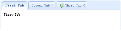
The tabs display a collection of panel. It shows only one tab panel at a time. Each tab panel has the header title and some mini button tools, including close button and other customized buttons.
依赖
- panel
- linkbutton
用法
创建标签页(Tabs)
1、通过标记创建标签页(Tabs)
从标记创建标签页(Tabs)更容易,我们不需要写任何 JavaScript 代码。记住把 'easyui-tabs' class 添加到 <div> 标记。每个标签页面板(tab panel)通过子 <div> 标记被创建,其用法与面板(panel)一样。
<div id="tt" class="easyui-tabs" style="width:500px;height:250px;">
    <div title="Tab1" style="padding:20px;display:none;">
        tab1
    </div>
    <div title="Tab2" data-options="closable:true" style="overflow:auto;padding:20px;display:none;">
        tab2
    </div>
    <div title="Tab3" data-options="iconCls:'icon-reload',closable:true" style="padding:20px;display:none;">
        tab3
    </div>
</div>
2、编程创建标签页(Tabs)
现在我们编程创建标签页(Tabs),我们同时捕捉 'onSelect' 事件。
$('#tt').tabs({
    border:false,
    onSelect:function(title){
        alert(title+' is selected');
    }
});
添加新的标签页面板(tab panel)
通过迷你工具添加一个新的标签页面板(tab panel),迷你工具图标(8x8)放置在关闭按钮前。
// 添加一个新的标签页面板(tab panel)
$('#tt').tabs('add',{
    title:'New Tab',
    content:'Tab Body',
    closable:true,
    tools:[{
        iconCls:'icon-mini-refresh',
        handler:function(){
            alert('refresh');
        }
    }]
});
获取选中的标签页(Tab)
// 获取选中的标签页面板(tab panel)和它的标签页(tab)对象
var pp = $('#tt').tabs('getSelected');
var tab = pp.panel('options').tab; // 相应的标签页(tab)对象
属性
| 名称 | 类型 | 描述 | 默认值 |
|---|---|---|---|
| width | number | 标签页(Tabs)容器的宽度。 | auto |
| height | number | 标签页(Tabs)容器的高度。 | auto |
| plain | boolean | 当设置为 true 时,就不用背景容器图片来呈现 tab 条。 | false |
| fit | boolean | 当设置为 true 时,就设置标签页(Tabs)容器的尺寸以适应它的父容器。 | false |
| border | boolean | 当设置为 true 时,就显示标签页(Tabs)容器边框。 | true |
| scrollIncrement | number | 每按一次 tab 滚动按钮,滚动的像素数。 | 100 |
| scrollDuration | number | 每一个滚动动画应该持续的毫秒数。 | 400 |
| tools | array,selector | 放置在头部的左侧或右侧的工具栏,可能的值: 1、数组,指示工具组,每个工具选项都和链接按钮(Linkbutton)一样。 2、选择器,指示包含工具的 <div>。 代码实例: 通过数组定义工具。
$('#tt').tabs({
    tools:[{
        iconCls:'icon-add',
        handler:function(){
            alert('add')
        }
    },{
        iconCls:'icon-save',
        handler:function(){
            alert('save')
        }
    }]
});
通过已有的 DOM 容器定义工具。
$('#tt').tabs({
    tools:'#tab-tools'
});
<div id="tab-tools">
    <a href="#" class="easyui-linkbutton" plain="true" iconCls="icon-add"></a>
    <a href="#" class="easyui-linkbutton" plain="true" iconCls="icon-save"></a>
</div>
|
null |
| toolPosition | string | 工具栏位置。可能的值:'left'、'right'。该属性自版本 1.3.2 起可用。 | right |
| tabPosition | string | 标签页(tab)位置。可能的值:'top'、'bottom'、'left'、'right'。该属性自版本 1.3.2 起可用。 | top |
| headerWidth | number | 标签页(tab)头部宽度,只有当 tabPosition 设置为 'left' 或 'right' 时才有效。该属性自版本 1.3.2 起可用。 | 150 |
| tabWidth | number | tab 条的宽度。该属性自版本 1.3.4 起可用。 | auto |
| tabHeight | number | tab 条的高度。该属性自版本 1.3.4 起可用。 | 27 |
| selected | number | 初始化选定的标签页索引。该属性自版本 1.3.5 起可用。 | 0 |
| showHeader | boolean | 当设置为 true 时,显示标签页(tab)头部。该属性自版本 1.3.5 起可用。 | true |
事件
| 名称 | 参数 | 描述 |
|---|---|---|
| onLoad | panel | 当一个 ajax 标签页面板(tab panel)完成加载远程数据时触发。 |
| onSelect | title,index | 当用户选择一个标签页面板(tab panel)时触发。 |
| onUnselect | title,index | 当用户未选择一个标签页面板(tab panel)时触发。该事件自版本 1.3.5 起可用。 |
| onBeforeClose | title,index | 当一个标签页面板(tab panel)被关闭前触发,返回 false 就取消关闭动作。下面的实例演示如何在关闭标签页面板(tab panel)前显示确认对话框。
$('#tt').tabs({
  onBeforeClose: function(title){
    return confirm('Are you sure you want to close ' + title);
  }
});
// using the async confirm dialog
$('#tt').tabs({
  onBeforeClose: function(title,index){
    var target = this;
    $.messager.confirm('Confirm','Are you sure you want to close '+title,function(r){
        if (r){
            var opts = $(target).tabs('options');
            var bc = opts.onBeforeClose;
            opts.onBeforeClose = function(){};  // allowed to close now
            $(target).tabs('close',index);
            opts.onBeforeClose = bc;  // restore the event function
        }
    });
    return false;    // prevent from closing
  }
});
|
| onClose | title,index | 当用户关闭一个标签页面板(tab panel)时触发。 |
| onAdd | title,index | 当一个新的标签页面板(tab panel)被添加时触发。 |
| onUpdate | title,index | 当一个标签页面板(tab panel)被更新时触发。 |
| onContextMenu | e, title,index | 当一个标签页面板(tab panel)被右键点击时触发。 |
方法
| 名称 | 参数 | 描述 |
|---|---|---|
| options | none | 返回标签页(tabs)选项(options)。 |
| tabs | none | 返回全部的标签页面板(tab panel)。 |
| resize | none | 调整标签页(tabs)容器的尺寸并做布局。 |
| add | options | 添加一个新的标签页面板(tab panel),options 参数是一个配置对象,更多详细信息请参见标签页面板(tab panel)属性。 当添加一个新的标签页面板(tab panel)时,它将被选中。 如需添加一个未选中的标签页面板(tab panel),请记得设置 'selected' 属性为 false。
// add a unselected tab panel
$('#tt').tabs('add',{
    title: 'new tab',
    selected: false
    //...
});
|
| close | which | 关闭一个标签页面板(tab panel),'which' 参数可以是要被关闭的标签页面板(tab panel)的标题(title)或索引(index)。 |
| getTab | which | 获取指定的标签页面板(tab panel),'which' 参数可以是标签页面板(tab panel)的标题(title)或索引(index)。 |
| getTabIndex | tab | 获取指定的标签页面板(tab panel)索引。 |
| getSelected | none | 获取选中的标签页面板(tab panel)。下面的实例演示如何获取选中的标签页面板(tab panel)的索引。
var tab = $('#tt').tabs('getSelected');
var index = $('#tt').tabs('getTabIndex',tab);
alert(index);
|
| select | which | 选择一个标签页面板(tab panel),'which' 参数可以是标签页面板(tab panel)的标题(title)或索引(index)。 |
| unselect | which | 选择一个标签页面板(tab panel),'which' 参数可以是标签页面板(tab panel)的标题(title)或索引(index)。该方法自版本 1.3.5 起可用。 |
| showHeader | none | 显示标签页(tabs)头部。该方法自版本 1.3.5 起可用。 |
| hideHeader | none | 隐藏标签页(tabs)头部。该方法自版本 1.3.5 起可用。 |
| exists | which | 指示指定的面板是否已存在,'which' 参数可以是标签页面板(tab panel)的标题(title)或索引(index)。 |
| update | param | 更新指定的标签页面板(tab panel),param 参数包含两个属性: tab:被更新的标签页面板(tab panel)。 options:面板(panel)的选项(options)。 代码实例:
// update the selected panel with new title and content
var tab = $('#tt').tabs('getSelected');  // get selected panel
$('#tt').tabs('update', {
    tab: tab,
    options: {
        title: 'New Title',
        href: 'get_content.php'  // the new content URL
    }
});

// call 'refresh' method for tab panel to update its content
var tab = $('#tt').tabs('getSelected');  // get selected panel
tab.panel('refresh', 'get_content.php');
|
| enableTab | which | 启用指定的标签页面板(tab panel),'which' 参数可以是标签页面板(tab panel)的标题(title)或索引(index)。该方法自版本 1.3 起可用。 代码实例:
$('#tt').tabs('enableTab', 1);    // enable the second tab panel
$('#tt').tabs('enableTab', 'Tab2');    enable the tab panel that has 'Tab2' title
|
| disableTab | which | 禁用指定的标签页面板(tab panel),'which' 参数可以是标签页面板(tab panel)的标题(title)或索引(index)。该方法自版本 1.3 起可用。 代码实例:
$('#tt').tabs('disableTab', 1); // disable the second tab panel.
|
| scrollBy | deltaX | 通过指定的像素数滚动标签页(tab)头部,负值表示滚动到右边,正值表示滚动到左边。该方法自版本 1.3.2 起可用。 代码实例:
// scroll the tab header to left
$('#tt').tabs('scroll', 10);
|
标签页面板(Tab Panel)
标签页面板(tab panel)属性被定义在面板(panel)组件里,下面是一些常用的属性。
| 名称 | 类型 | 描述 | 默认值 |
|---|---|---|---|
| id | string | 标签页面板(tab panel)的 id 属性。 | null |
| title | string | 标签页面板(tab panel)的标题文字。 | |
| content | string | 标签页面板(tab panel)的内容。 | |
| href | string | 加载远程内容来填充标签页面板(tab panel)的 URL。 | null |
| cache | boolean | 当设置为 true 时,在设定了有效的 href 特性时缓存这个标签页面板(tab panel)。 | true |
| iconCls | string | 显示在标签页面板(tab panel)标题上的图标的 CSS class。 | null |
| width | number | 标签页面板(tab panel)的宽度。 | auto |
| height | number | 标签页面板(tab panel)的高度。 | auto |
| collapsible | boolean | 当设置为 true 时,允许标签页面板(tab panel)可折叠。 | false |
一些附加的属性。
| 名称 | 类型 | 描述 | 默认值 |
|---|---|---|---|
| closable | boolean | 当设置为 true 时,标签页面板(tab panel)将显示一个关闭按钮,点击它就能关闭这个标签页面板(tab panel)。 | false |
| selected | boolean | 当设置为 true 时,标签页面板(tab panel)将被选中。 | false |
jQuery EasyUI 插件